The Challenge
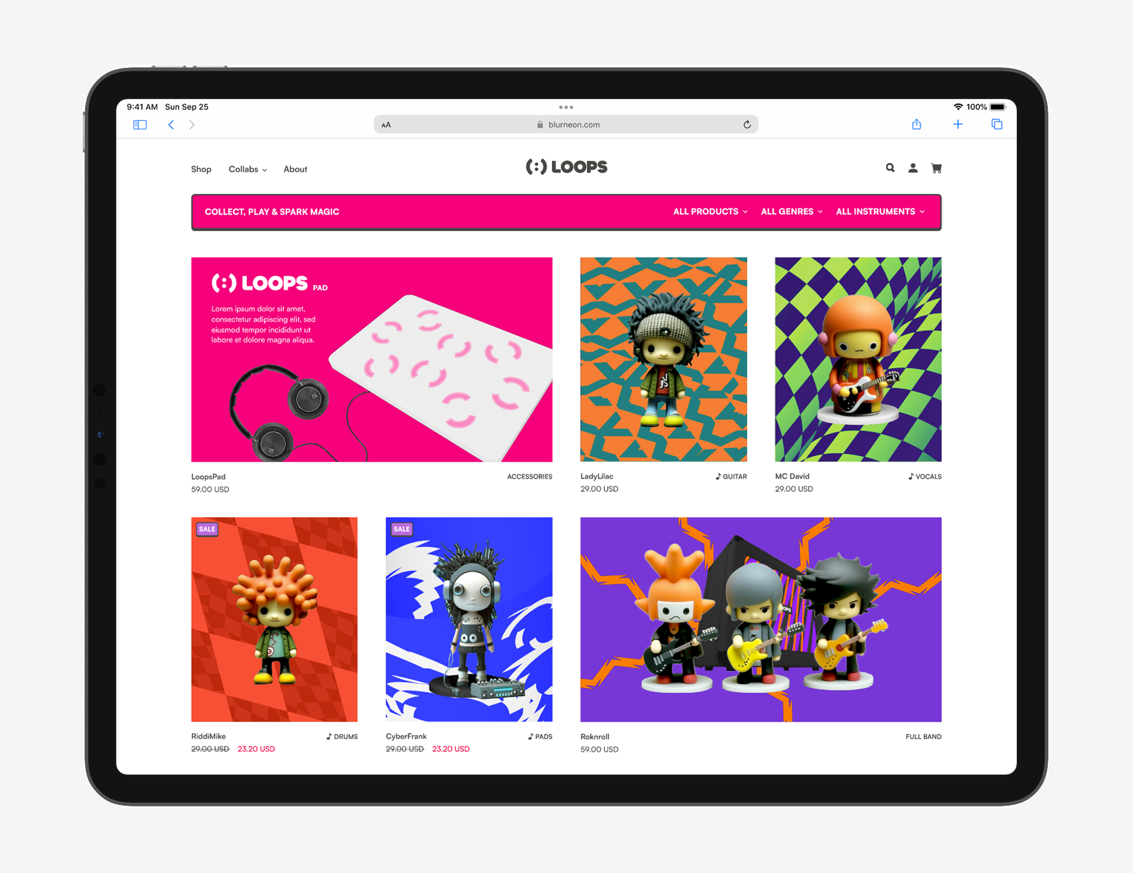
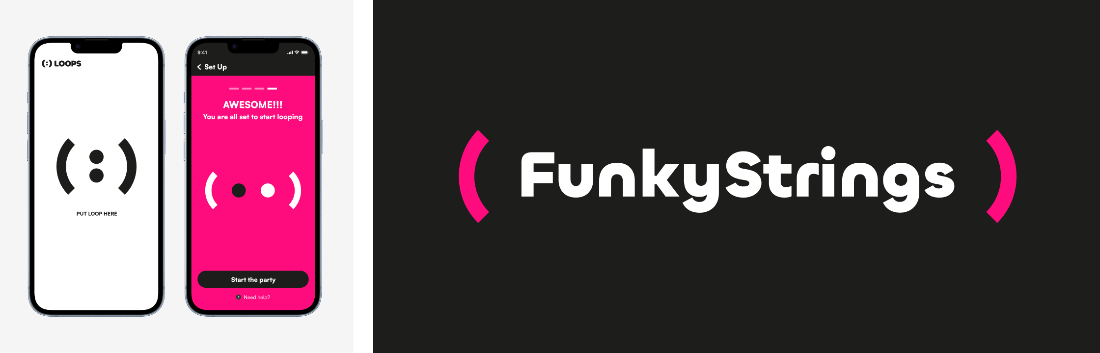
The first time Ayal Yona introduced Loops, the concept immediately stood out as a platform where anyone could create endless musical combinations without needing to be a musician. Different genres could seamlessly mix together into one unique loop, created in less than a minute.
One of the main challenges I faced was shaping a brand identity for a platform built from many different musical worlds. I had to find a way for jazz, rock, electro, country, and classical music to all coexist within one cohesive and recognizable visual system.
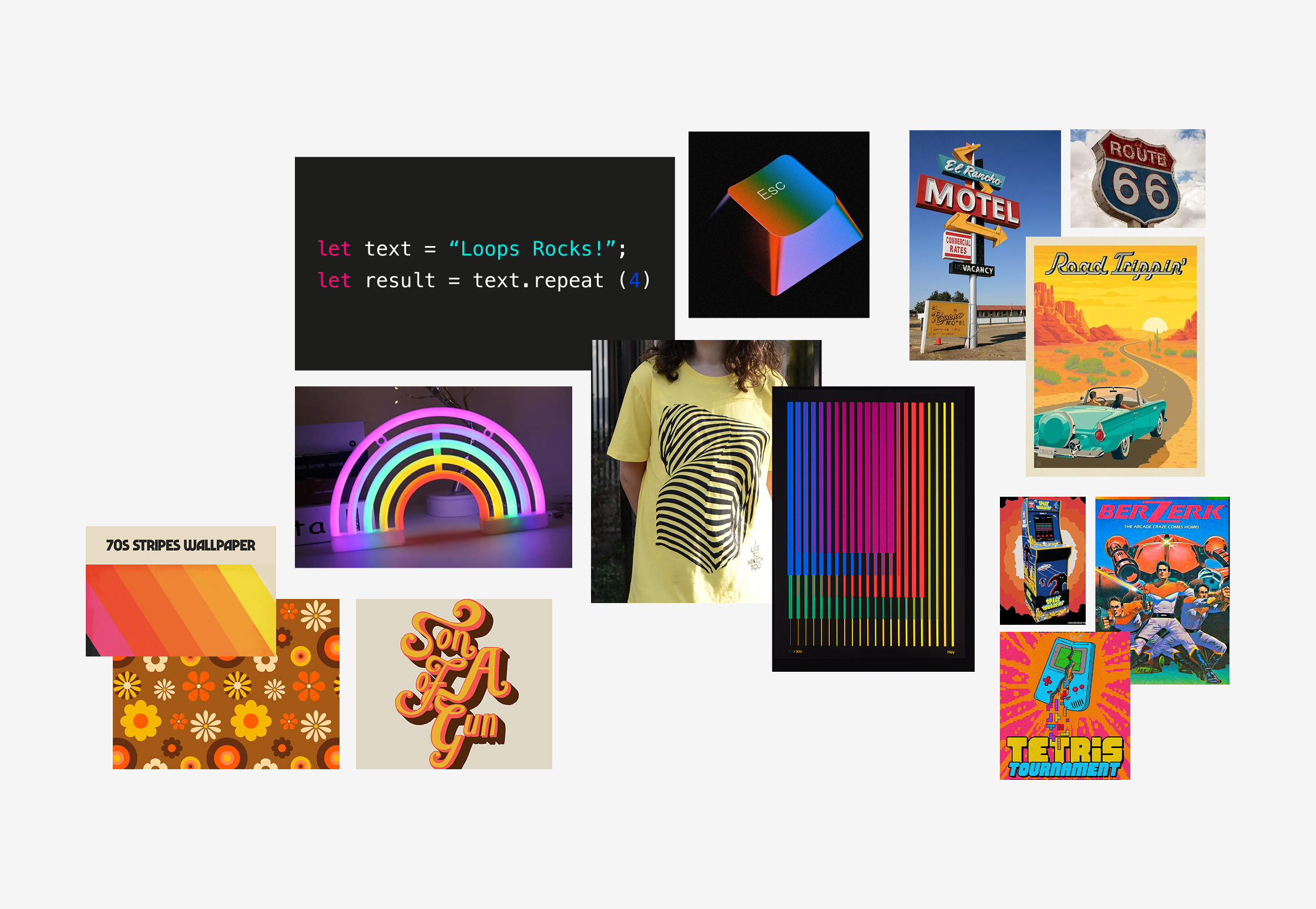
Moodboard
I understood early on that one of the keys to making this project successful was investing deeply in the strategy and mood board phase. It created an open visual playground that allowed the brand to zoom in and out between different musical worlds, while exploring how endless graphic elements could work both together as a system and independently as strong standalone pieces on the shelf.
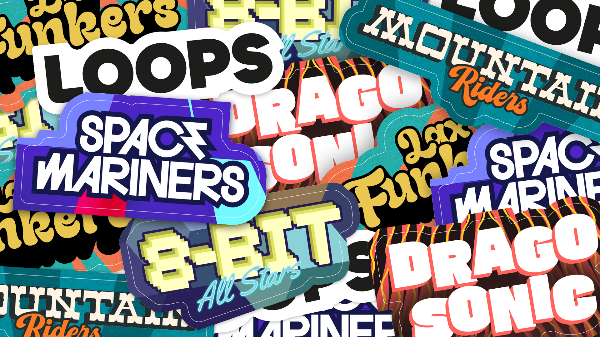
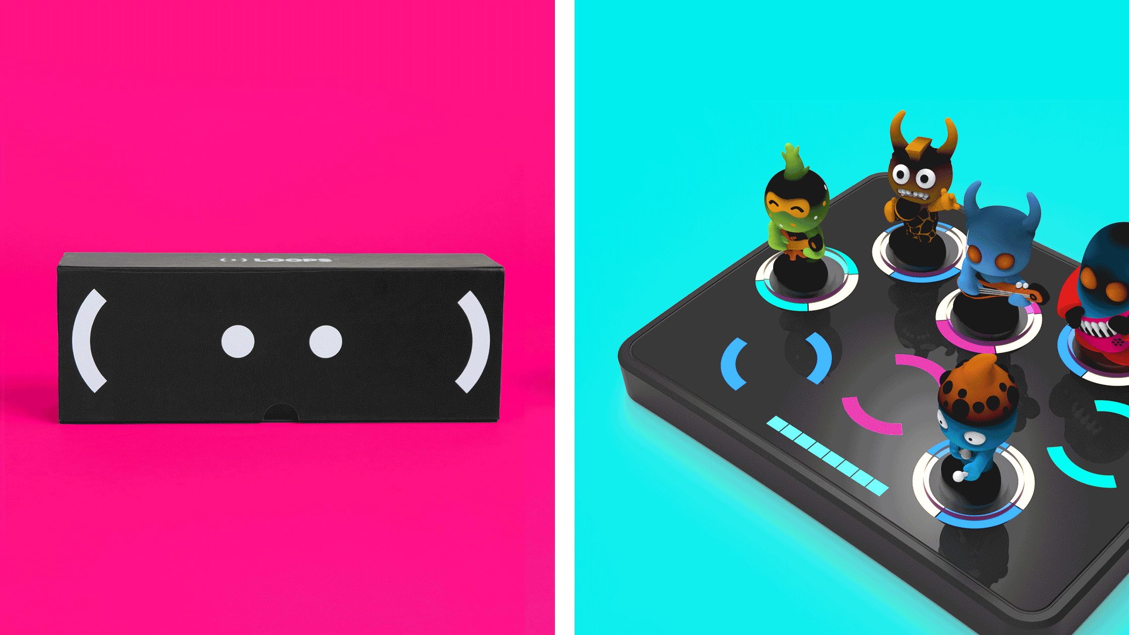
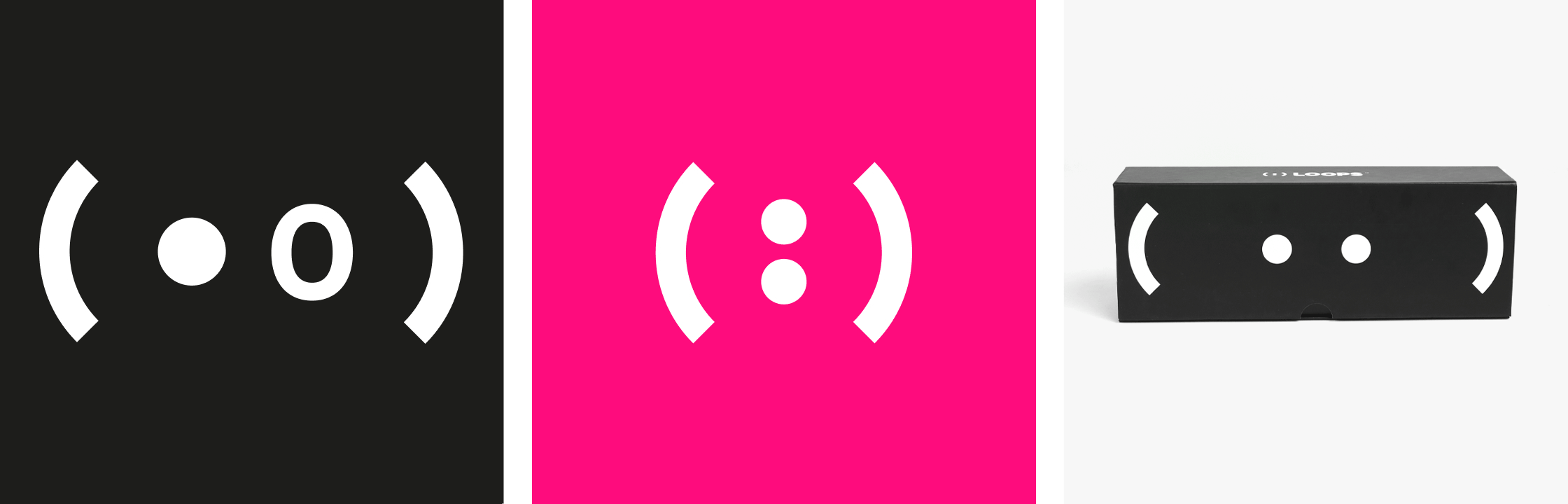
The Symbol
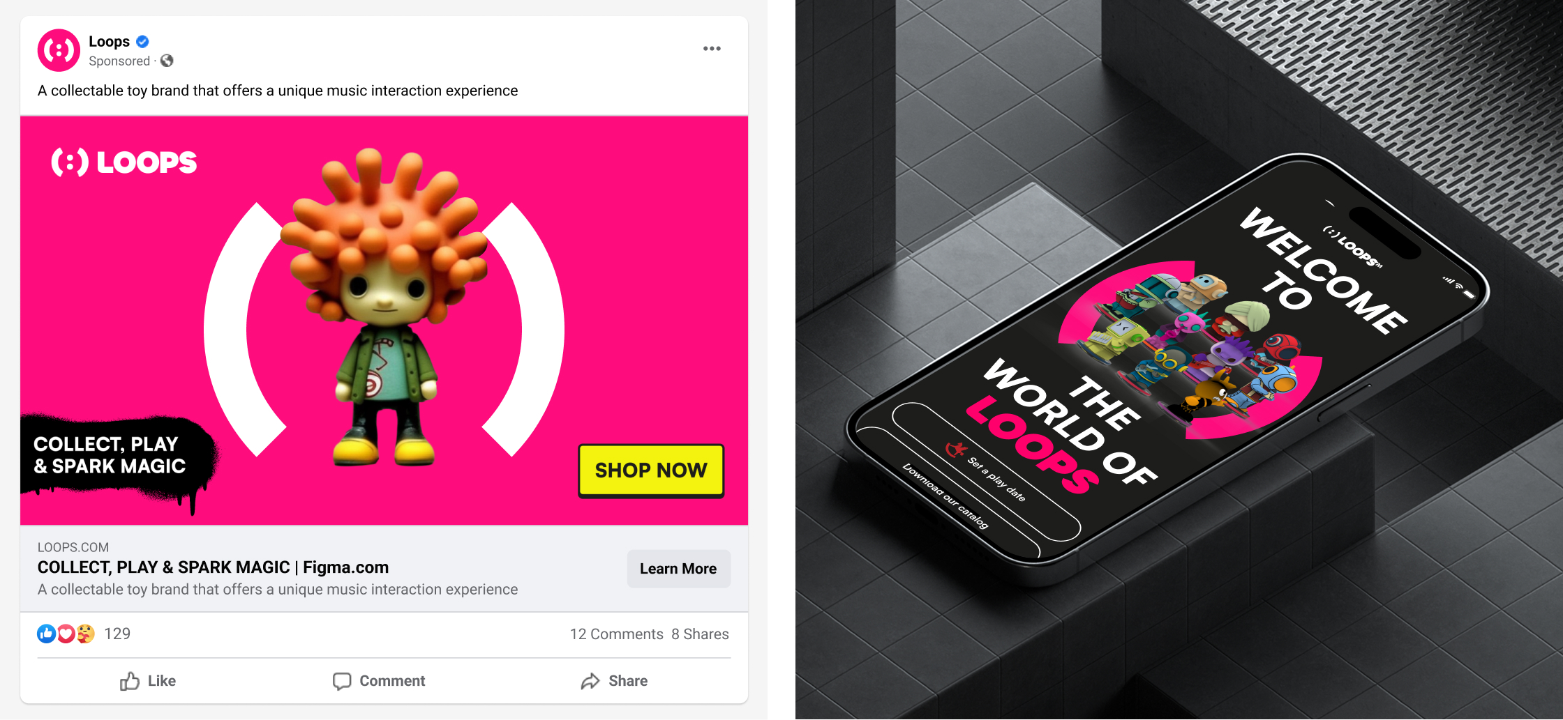
I knew the brand needed a strong symbolic element something that could become the face of the entire system across packaging, social media, the app, and all marketing assets.
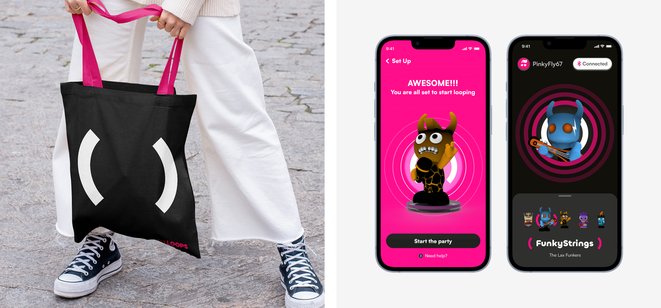
The starting point came from music notation itself: the repeat symbols (:||) and (||:). From there, I began developing a flexible emoticon-inspired graphic language that could constantly evolve while still remaining simple, recognizable, and connected to the core idea of looping music.
Visual Language
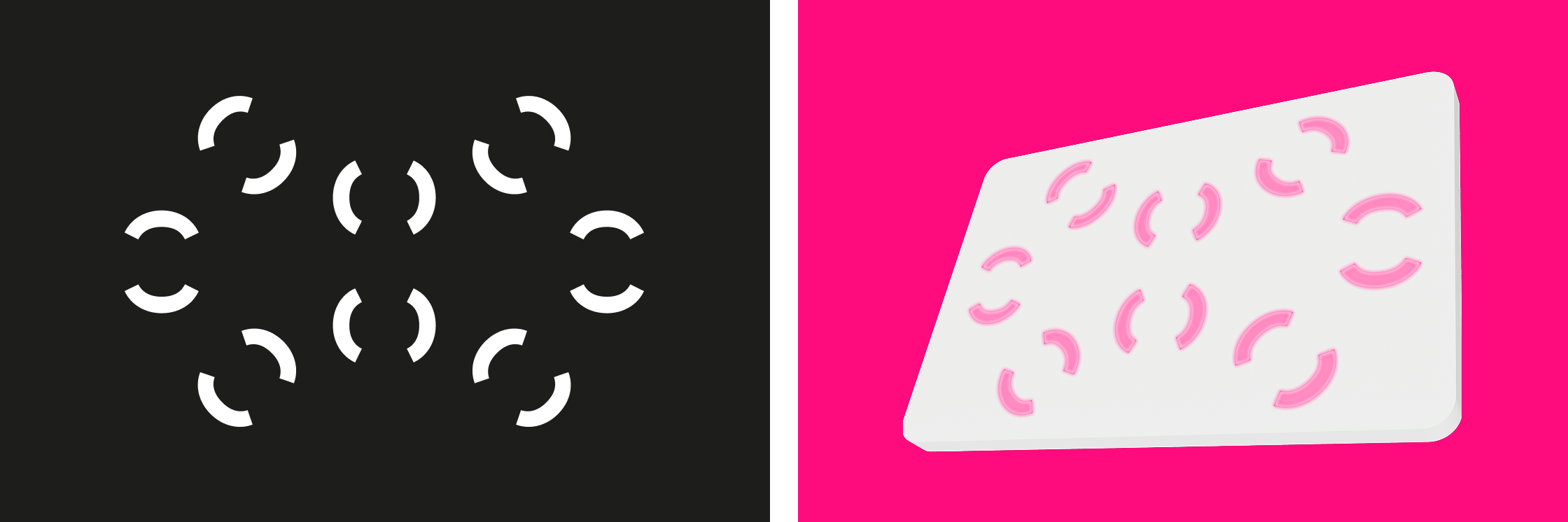
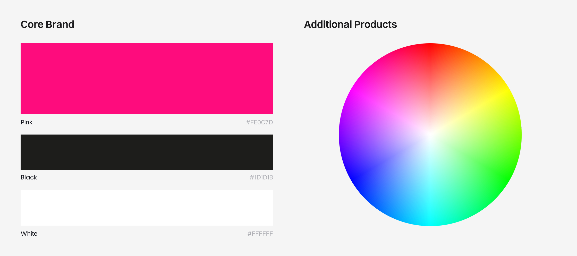
“The Open Canvas” became the foundation of the visual language a system designed to evolve endlessly, just like the music itself.With such a wide range of graphic assets and musical genres, the goal was to keep the core identity clean and elegant. Simple typography, minimal icons, and a restrained palette of black, white, and magenta created a strong foundation, while a dynamic color system allowed the brand to constantly shift, combine, and expand across different musical worlds.
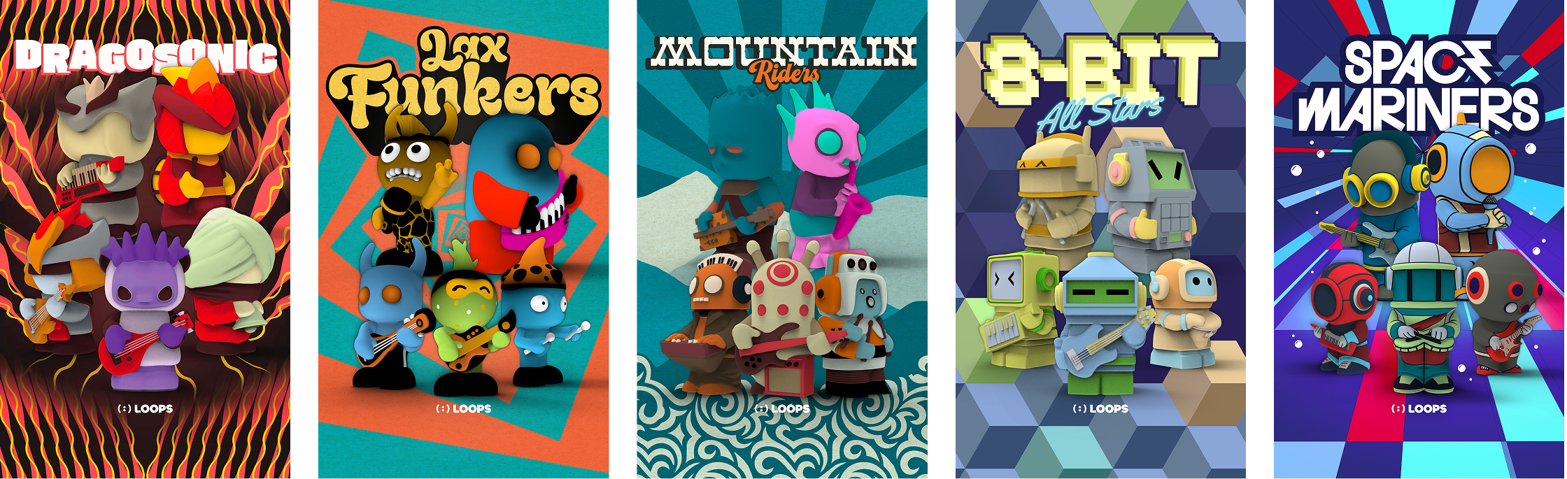
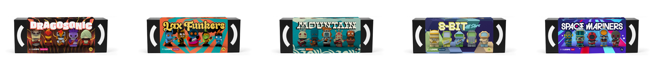
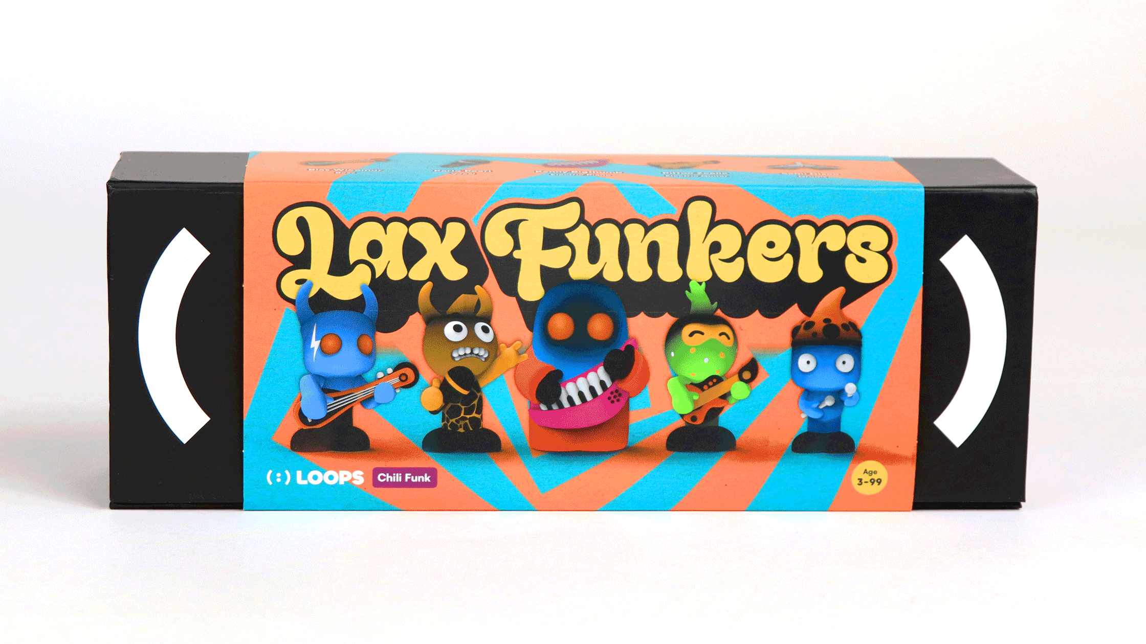
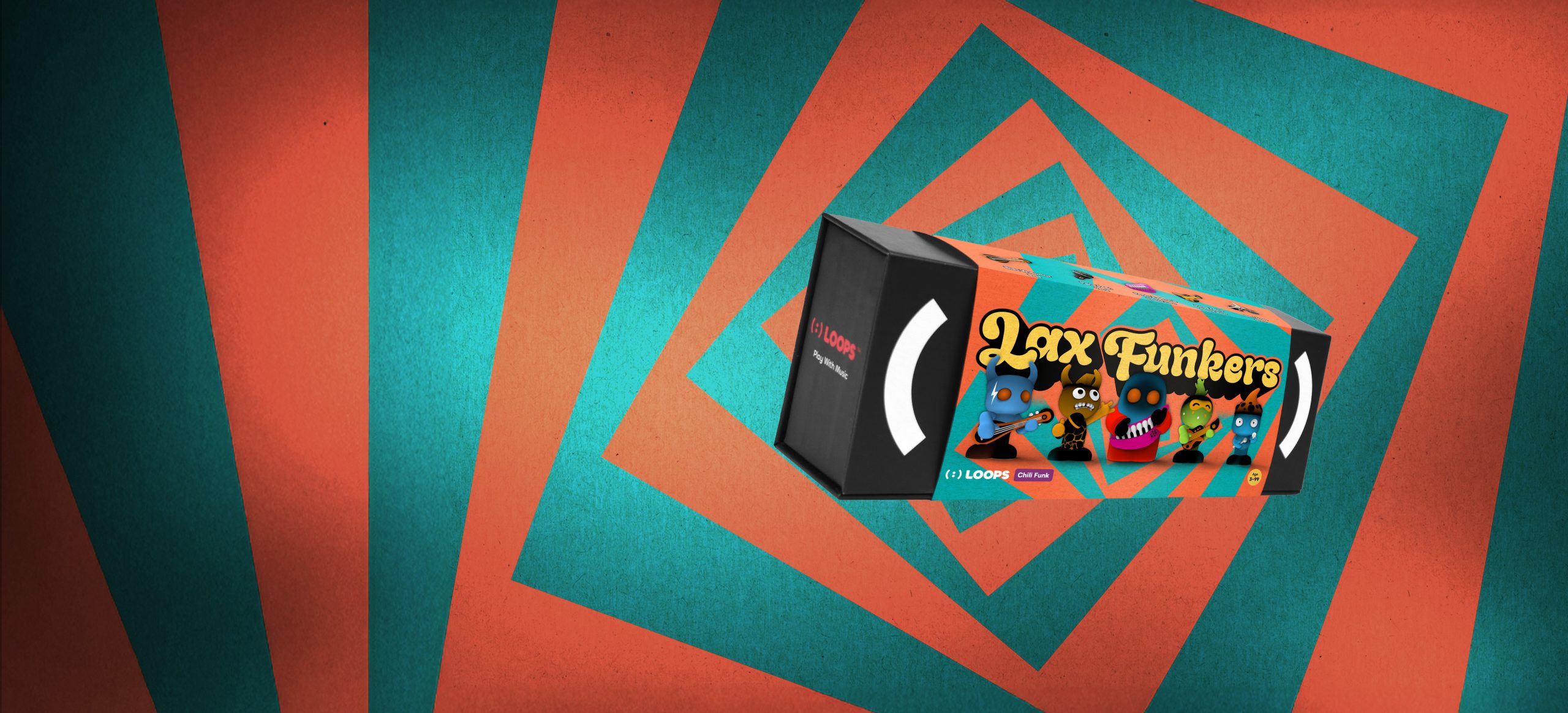
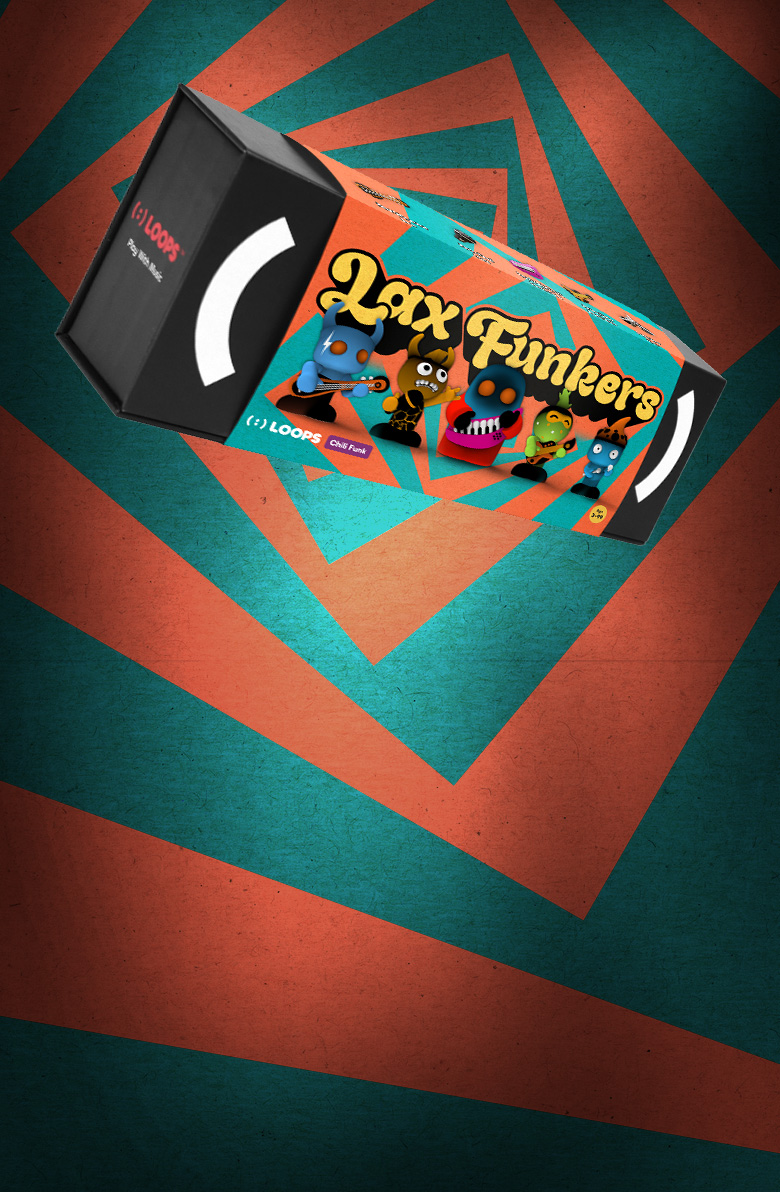
Packaging
For me, the packaging became one of the most important parts of the project, since it’s the very first interaction people have with the brand. Each band received its own cover design, inspired by the feeling of a concert poster inviting customers to step into the music and join the experience.
The packaging was also designed to become part of the product itself, transforming into a stand that holds the figure while playing.